Goal
Make the garden show how far along each idea is, not just that it exists, and make it look like mine instead of like a theme.
Why a digital garden
A blog post shows what I finished. A garden shows how I got there.
Going from junior to senior isn't one big leap. It's a long trail of small things that finally click: a watcher, a slot, a composable and a random podcast that makes sense. Most of that trail usually lives in a notebook nobody sees, my the notes section of my planner or in my head, where it fades or goes poof. This garden puts it somewhere public, dated and linked ….. shall we say accountability embodied. So here are some of the things this does for me:
- It makes growth visible. Every note says when it was planted and when I last tended it. Anyone can watch an idea go from "probably wrong in places" to "I'd teach this," and so can I.
- It compounds. Notes link to each other, and backlinks show what depends on what. A concept I understood last year becomes the base for something I'm learning now.
- It runs the flywheel. Learn, build, (sell?), teach . The growth stages map straight onto it: a seedling is something I'm learning, budding means I've built with it, evergreen means I can teach it (and in time, sell it).
It's also evidence over claims. A résumé line says "Vue 3 and TypeScript." The garden shows the dated notes, the examples I used, and where my understanding changed.
The longer version of why I started gardening is on developingdvlpr.com/digital_garden.
The problem
By August 2026 the garden had stopped looking alive, here are the things that made it feel dead:
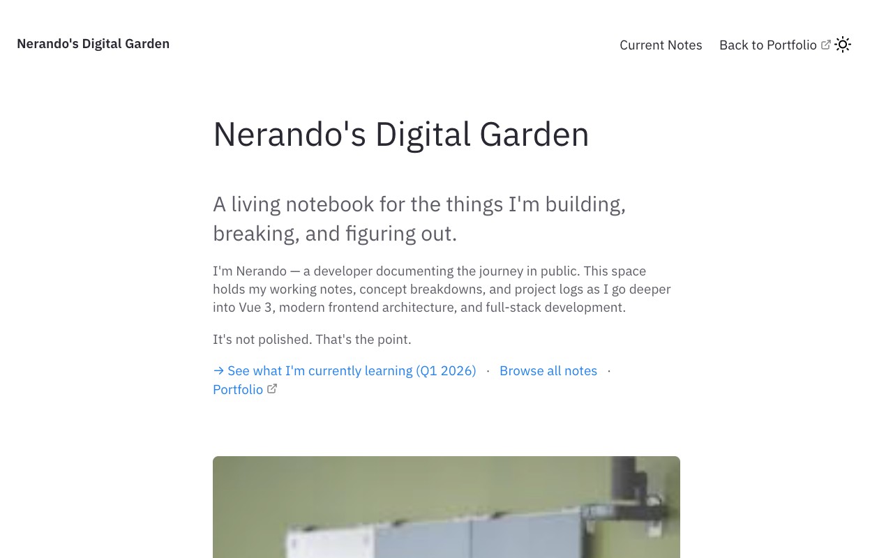
- The homepage still pointed at "what I'm learning in Q1 2026."
- Theme demo pages, a theme author's credits and an empty "List of lists" page were still public.
- Eight links in my status tables pointed at files that never existed.
- The banner was hotlinked from a Google image-search thumbnail.
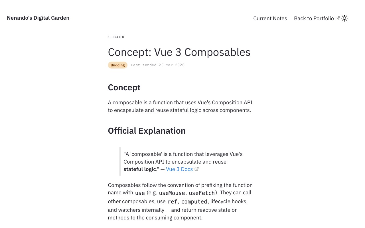
- There was no way to tell a rough note from a solid one.
- The Rolodex had five unfilled
[ Term ]cards, nine empty letters, and a code example that printed9where9should be. - Dark mode forgot your choice on every visit, and keyboard users couldn't reach the toggle ( an accessibility issue ).
Success criteria
Set before any code changed, so the result can be checked against them.
| Criterion | Target |
|---|---|
Lighthouse mobile (homepage, a note, /notes) |
Accessibility, Best Practices, SEO ≥ 95; Performance ≥ 90 |
| axe DevTools | 0 serious or critical issues |
| Contrast | Every text pair ≥ 4.5:1 in both themes |
| Growth data | Every public note has stage and tended |
| Links | 0 broken internal links, checked on every PR |
| Review | Every change goes through a PR with a deploy preview |
| Upkeep | At least one note tended every month going forward |
Palette / Design Taste
Two themes, one set of token names. Every text/background pair is measured against the WCAG 4.5:1 minimum.
| Token | Role | Light | Dark | Contrast on ground (light / dark) |
|---|---|---|---|---|
| ground | page background | #F3F5F0 |
#111813 |
n/a |
| surface | cards and panels | #FFFFFF |
#18211B |
n/a |
| ink | body text | #17231C |
#E6EBE2 |
14.79 / 14.90 |
| muted | dates, meta, secondary text | #4F5E54 |
#A9B5AC |
6.25 / 8.50 |
| line | borders and dividers | #D6DDD2 |
#2C3A31 |
decorative |
| accent | links, primary button, brand | #24573F |
#7FC4A0 |
7.62 / 8.85 |
Button text on the accent: 8.37 (light) / 8.85 (dark). Code blocks use a dark panel in both themes; every syntax colour is at least 5.4:1.
It's a garden, so it should look like one. Sage for the ground, a deep green for anything you can click. The old blue-on-white was the theme's default, not a choice, and it said "Jekyll site" before it said anything about me. The deep green also earns its keep: it clears 7:1 on the sage, so links stay readable without me reaching for bold. Dark mode isn't an afterthought either. Same token names, new values, so no component ever has to ask which theme it's in.
Type \ Fonts Selection
- Space Grotesk: headings
- IBM Plex Sans: body text
- IBM Plex Mono: dates, meta and code
There is a corelation between what information is presented and how it's styled, thus three faces is equal to three jobs. Space Grotesk gives the headings some personality without being loud. Plex Sans is there to be read for a long time, which is most of what a note is. Plex Mono marks anything that's data rather than prose: dates, stages, code. Sans and Mono come from the same family, so they can sit together without fighting. One face could have done all three jobs. It just couldn't have told you which job a piece of text was doing or what message it was trying to convey.
Growth stages / Idea Maturity
| Stage | Meaning | Flywheel step | Chip contrast (light / dark) |
|---|---|---|---|
| Seedling | Rough idea or first notes. Probably wrong in places. | Learn | 7.25 / 10.13 |
| Budding | It clicked. Written in my own words, with an example I've used. | Build | 6.50 / 9.14 |
| Evergreen | Applied in real work. I'd teach it from this note. | Teach | 8.37 / 8.85 |
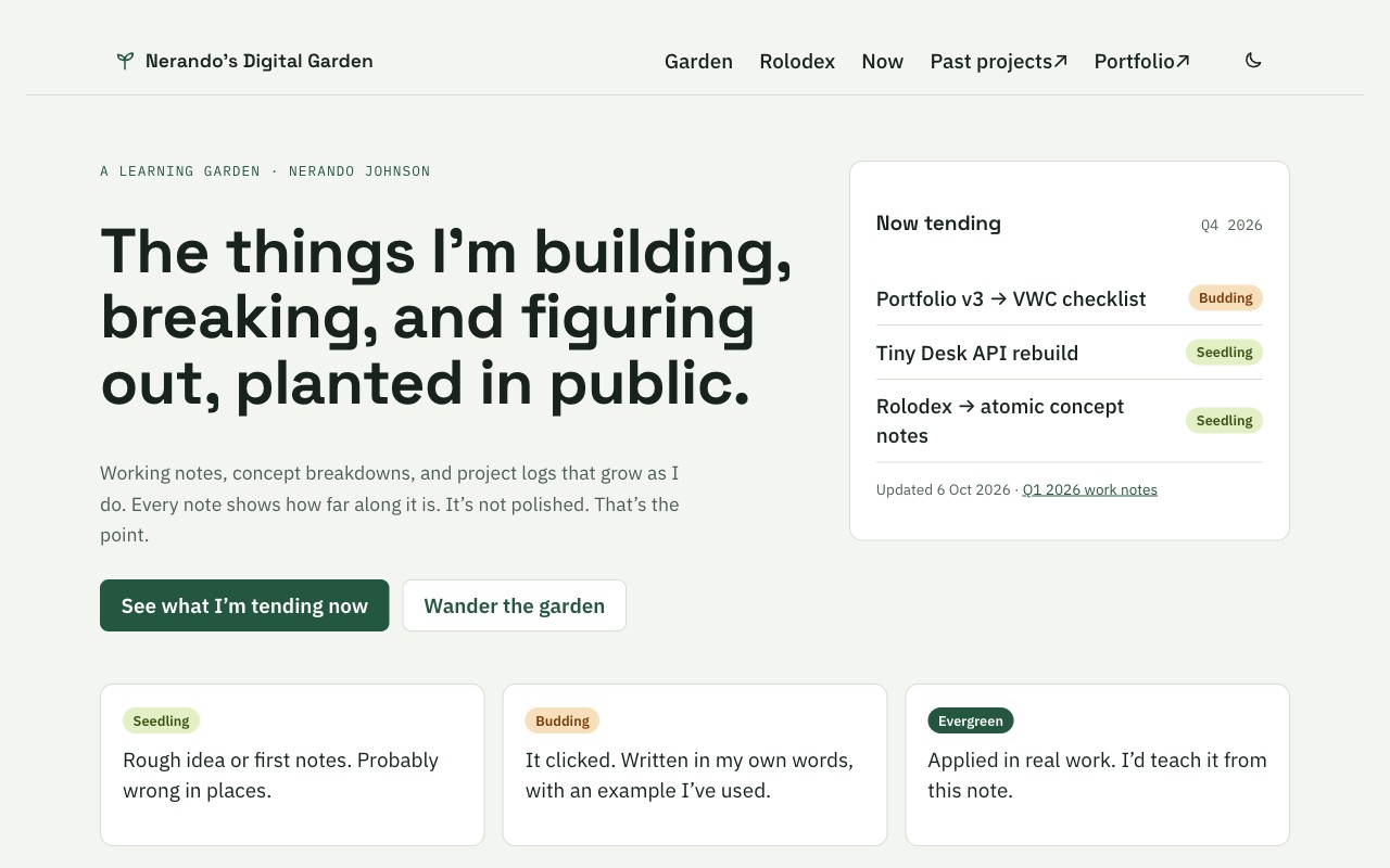
The garden always said "it's not polished, that's the point." Stages seen make that honest instead of an excuse. A seedling is allowed to be wrong, and now it says so up front. The aim after all is progress rather than perfection, with a label on it. Chips over icons because a word can't be misread: "Budding" means budding, while a little sprout icon means whatever you guess it means. Each chip also differs in lightness, not just colour, so the stage still reads if you can't tell the greens from the oranges.
Data model
Everything the design shows comes from (front matter)[https://gohugo.io/content-management/front-matter/] and one data file. No page hardcodes a stage or a date.
| Field | Where | Type | Used for |
|---|---|---|---|
title |
each note | text | heading, feed, page title |
date |
each note | YYYY-MM-DD |
"planted" date |
stage |
each note | seedling · budding · evergreen |
stage chip, filters, legend |
tended |
each note | YYYY-MM-DD |
"last tended", Recently tended order (falls back to date) |
feed |
each note | show · hide |
whether the note appears in lists |
quarter, updated, items |
_data/now.yml |
text, date, list | the Now tending card |
term, topics, stage, added, my_version, definition, example, docs, note |
_data/terms.yml |
one entry per Rolodex term | the Rolodex cards, filters and stats |
Renamed notes get a 301 in Netlify's _redirects file, so old links keep working.
Layout
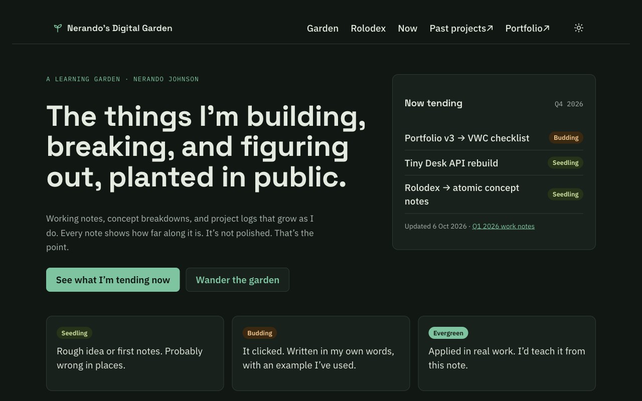
Homepage, top to bottom: hero, Now tending card, stage legend, Recently tended (the five most recently tended notes), Rolodex teaser, footer.
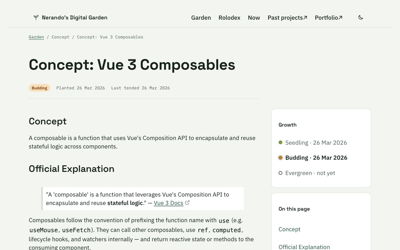
Note page: breadcrumb, title, meta row (stage, planted, last tended), then the article with a sidebar holding the growth timeline, an on-this-page list and the notes that link here.
The homepage answers the questions in the order people actually ask them. Who is this? What's he working on right now? How do I read these labels? What's new? The legend sits above the list on purpose: the chips should make sense before you see twenty of them. On notes, backlinks used to sit at the very bottom, where nobody scrolls. Now they sit beside the article, because in a garden the connections between notes matter as much as the notes themselves.
Rolodex: header with stats, a sticky filter bar (text, topics, A–Z), then cards grouped by letter. Each card leads with my version and puts the official definition underneath, because the page exists for the words I'd actually use. Every term carries its own stage, and when one outgrows its card it gets a "Full note →" link.
Tradeoffs
Each one has a short decision record in the repo under docs/adr/.
- Stayed on Jekyll instead of moving to Astro now. Astro is my documentation stack, but a rewrite and a redesign at once means two things can break. I upgraded Jekyll, kept the markup in small includes, and left the move for v2.
- Netlify over GitHub Pages. Deploy previews on every PR let me check a change before it ships, and redirects and headers live in the repo where they get reviewed.
- CSS tokens over a framework. One file of custom properties is all the garden needs. Bulma brought far more than it used.
- Removed math support. KaTeX shipped about 1.5 MB of fonts for a single demo page. If I need math later, it loads only on notes that ask for it.
What I rejected
- Bulma defaults: replaced by the token file and the garden components. A stock theme looks like every other Jekyll Garden. Bulma 0.8 also came with far more CSS than the garden ever used.
- The hotlinked banner: replaced by a text hero; there are no hotlinked images on the homepage. It was a Google image-search thumbnail, which isn't my image and could disappear any day.
- The per-quarter checkbox rollover: replaced by a quarter close-out, with three lists: what grew, what got composted, and what carries forward (three items max). The same three projects rolled from Q3 2025 to Q1 2026, with almost thirty "carried to" markers. That's a backlog, not a garden. Composting something is a decision too.
- Hand-written HTML in the Rolodex: replaced by one data file and one include. Adding a term used to mean copying a 25-line block of HTML into a 711-line page. Now it's one entry in
_data/terms.yml.
Architecture
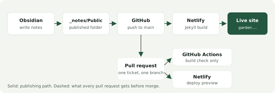
Netlify builds and hosts the site; GitHub Actions only checks that it builds. Every change goes through a pull request with its own deploy preview before it reaches main.
How it was built
I used Claude to audit the old garden, mock up the new design and break the work into small GitHub issues, each with acceptance criteria and a scope guard. Claude Code worked through the issues one at a time, reading a short CLAUDE.md in the repo instead of re-reading the whole codebase every time. The whole redesign shipped as 20 pull requests over two days, 6–8 October 2026, each with its own deploy preview.
What AI did: the audit, the first mockup, the tickets, most of the template and CSS changes, and a first draft of the reasoning in this note.
What I owned: the direction (a learning garden, not a blog), the palette and the growth-stage vocabulary, which notes to keep or compost, the confidentiality review of my work notes, every merge, and the final words here. I can explain every line that shipped.
Where AI got it wrong:
- It tried to publish its own instructions. The very first change, adding
CLAUDE.md, would have put that file on the live garden as a public page. Jekyll copies any file without front matter into the site. I caught it in the same pull request and excluded it. Since then, every new file at the repo root gets checked against the exclude list. - It suggested a work example. The first mockup's "grow this note" box suggested adding a composable from my day job, which is exactly what my public-content rule says not to do. I caught it in review.
Outcome
Before is the garden as of 28 March 2026; after is 7 October 2026.
| Measure | Before | After |
|---|---|---|
| Lighthouse SEO (mobile) | 92 | 100 |
| Broken links in the status tables | 8 | 0 |
| Theme demo pages still public | 3 | 0 |
| Rolodex placeholder cards / empty letters | 5 / 9 | 0 / 0 |
| Notes showing a growth stage | 0 of 9 | 9 of 9 |
| Math fonts shipped with every page | 1.5 MB | 0 |
| Hotlinked homepage banner | 1 | 0 |
Every pull request now gets a Lighthouse run (mobile, median of three) in its CI summary, so these numbers stay checked instead of claimed.
Before and after
Before: the homepage and a note page on the original theme.
After: the same pages on the learning-garden design.
What I'd change in v2
- Move to Astro 5 content collections so the garden and Learnt can share components.
- Promote more Rolodex terms into their own concept notes, so the backlinks have more to connect.
- Show a note's growth history from Git, not just its latest stage.
- Self-host or drop the five GIFs still hotlinked in the work notes.
Related
- Why I keep a digital garden
- The Developer's Flywheel: Learn, Build, Teach
- Learnt — past projects
- Portfolio
The garden doesn't need to be finished. It needs to show where each thing is.